Logo Official

Payment Terminals

Improving revenue and loyalty by offering a solution to accept physical credit cards.


Background info

NexHealth is a patient experience platform for medical and dental offices. While we offered text-to-pay and saved-card payment options, we didn’t have a good way to handle in-office payments, something we assumed was a small part of our users’ needs.

Through customer conversations and data analysis, we discovered that in-office payments made up around 80% of total payment volume. This was a huge gap in our offering, and really hurting our customer loyalty.
Project stats

  • Duration: 8 months
  • Launched: Q1 2025
  • My roles: Sole designer, researcher (split with PM)

Problem discovery + research

During customer calls, we kept hearing the same story: practices loved using NexHealth for online payments, but still relied on separate (sometimes clunky) payment processors for in-person transactions. Curious, we dug into the data and found that around 80% of all payment volume actually happened in the office.

That meant most of our customers were splitting their workflow across two systems. As a result many weren’t using our payments product nearly as much as they could, all while having to do double the bookkeeping work.

So our mission became clear: Make in-office payments seamless within NexHealth, without forcing practices to change the way they already worked.


Goals

Our success metric was simple: increase the average payment volume for practices using our system. But just as important was the user success metric: would front-desk staff be able to collect payments quickly and confidently, without extra steps or friction?

We wanted NexHealth to be the one tool a practice used to collect every payment, whether online or in person.


Designing the MVP

Since we’re a software company (not a hardware one), we partnered with Stripe to use their modern Android-based card readers.

To move fast, we started with practices using the simpler, non–ledger-sync version of our payments product. That gave us a clean foundation to test the experience without technical overhead.

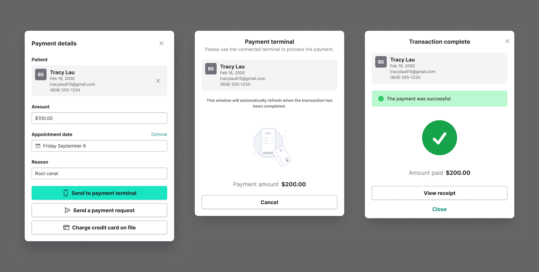
I added a new option to the existing payment request flow: "Send to payment terminal". The entire process lived inside a modal to maintain familiarity with the rest of our UI. It included waiting and success states, plus error handling and a digital receipt.

We delivered the first ten devices by hand to local practices, literally sitting with practices to help set them up. It wasn’t scalable, but it let us see how real users interacted with the product up close.

Room for delight

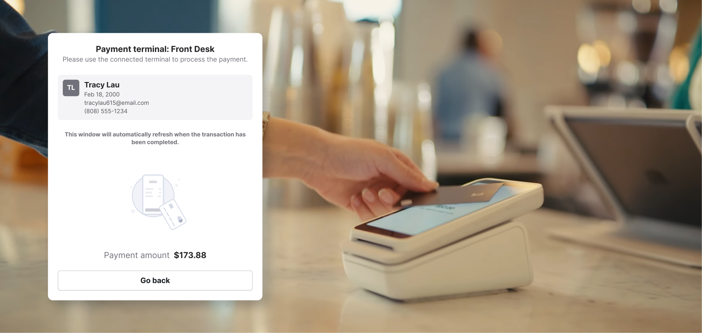
From the beginning I knew that I didn't just want a boring spinner on the "waiting for card" modal. Using styles consistent with the rest of our illustrations, I created a looping animation that made sense for the context.

Initially we implemented a static graphic, but I shortly created an animated SVG for the animation. Working with one of our front end developers, I was able to add it to the codebase myself.

Scaling to Complex Workflows

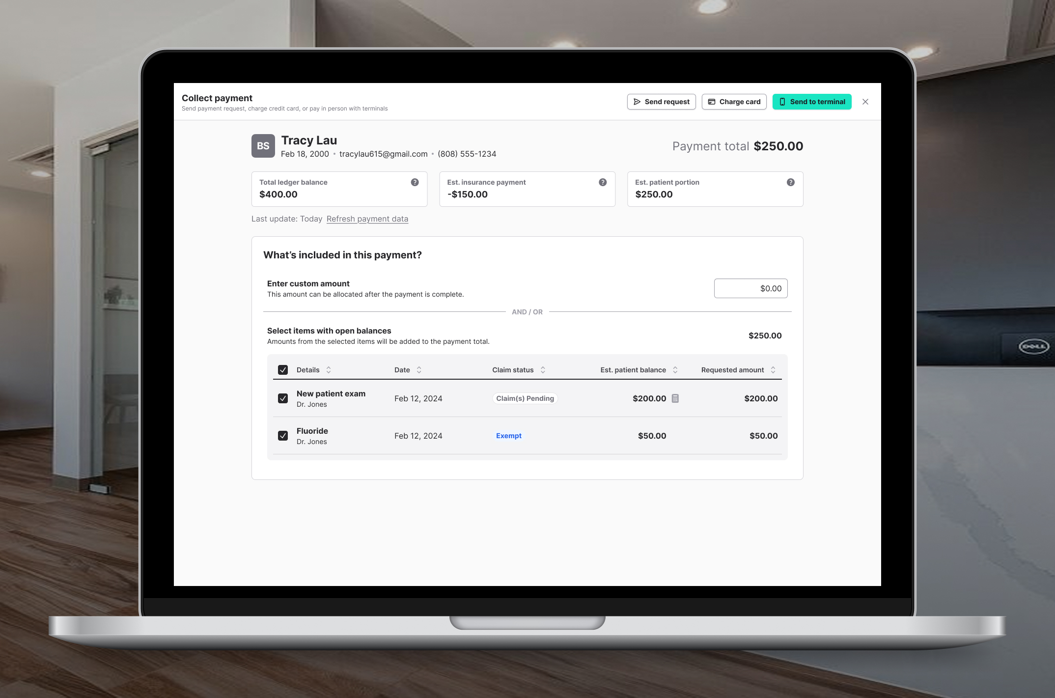
Our next challenge was supporting practices that used ledger syncing with their health record systems. This version of the product included itemized procedures and a more complex UI, meaning we couldn’t just drop in the same flow.

Previously, collecting payments took users out of their workflow and into a new page. Since we were reworking the experience anyway, I redesigned it to live inside a full-screen modal, keeping users in context while giving them room to manage details. Users really loved it, and we eventually migrated other payment flows to this pattern for consistency.

Handling Sync Complexity

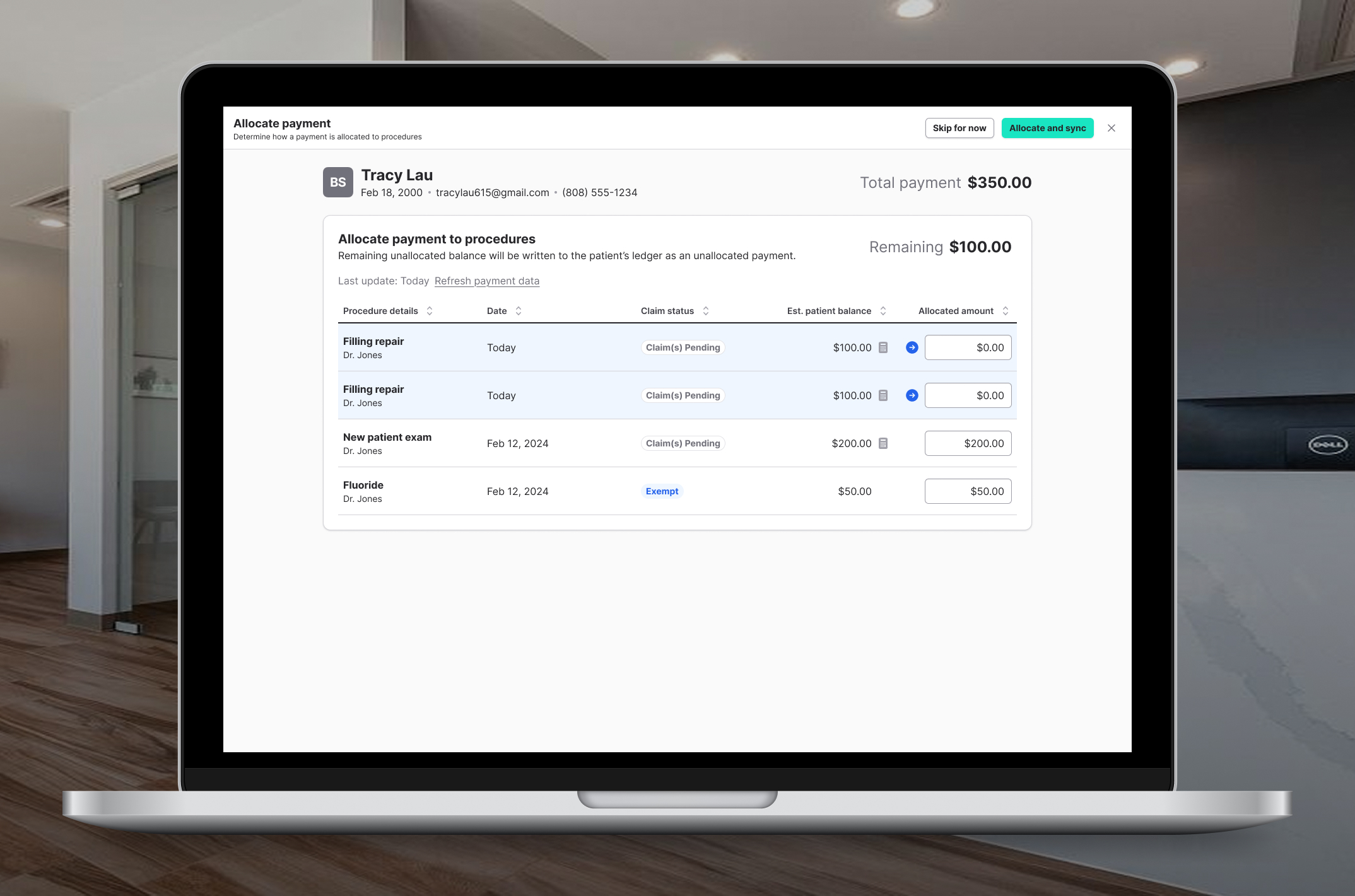
With ledger syncing, practices needed to allocate payments to specific procedures. I designed a new allocation step to handle this. Once the payment was completed, the user would be presented with a list of procedures where they could allocate the amounts.

Over time, we improved the intelligence of this flow. The first version required the user to enter amounts, then we improved by auto-filling any amounts we could with confidence. Eventually we got to the point where we could simply allocate automatically if the amounts matched, and skip this screen entirely.

Adding Multi-Terminal Support

As practices used the terminals more, many wanted a second or third device. That introduced a new design challenge: how to select a specific terminal without cluttering the UI or adding clicks.

After exploring several options, I landed on a combination dropdown button, a compact pattern that let users choose another terminal instantly while still keeping their default selection just one click away. This pattern eventually made its way into other parts of our design system.


Results & Reflection

The results were dramatic: Payment volume increased by an average of 4,000% per practice who used payment terminals. Practices reported smooth operations and very few CS tickets about the experience. We even saw an increase in usage for other payment features as a byproduct of using only one payment processor.

By questioning an assumption about our users' behavior, we introduced a major growth driver for the business. And by focusing on workflow continuity, designing for quick validation, and staying close to users, we built something that genuinely changed how practices ran their businesses.