Payment Terminals
Introduced a new payment product to fill a gap in our current offering
I led the design on a new payment product that allowed our customers to accept physical credit cards. We rolled out the new feature in phases, learning & improving along the way.
Background
NexHealth is a patient experience platform for medical & dental offices. We offered payment solutions, but it was difficult to use them to accept physical credit cards. Since our customers needed to accept payments in the office, they had no choice but to use a different company to process those payments.
NexHealth offers two types of payment products: One is the Ledger Sync service, which keeps payments in sync between NexHealth and the patient's ledger in the practice's health record system. The other is the basic non-syncing service, where practices need to manually enter payments into the ledger themselves. Our goal was to offer the new terminals product for both of these options.
Project goals
The users
Using multiple payment systems is a headache, requiring extra work each day to balance the books.
The business
Our payments usage was low since practices wanted to keep their payments in one system. Additionally, we were missing out on a huge revenue opportunity, since in-office payments are the most common type of payment.
Partnership
What does a SAAS company know about hardware?
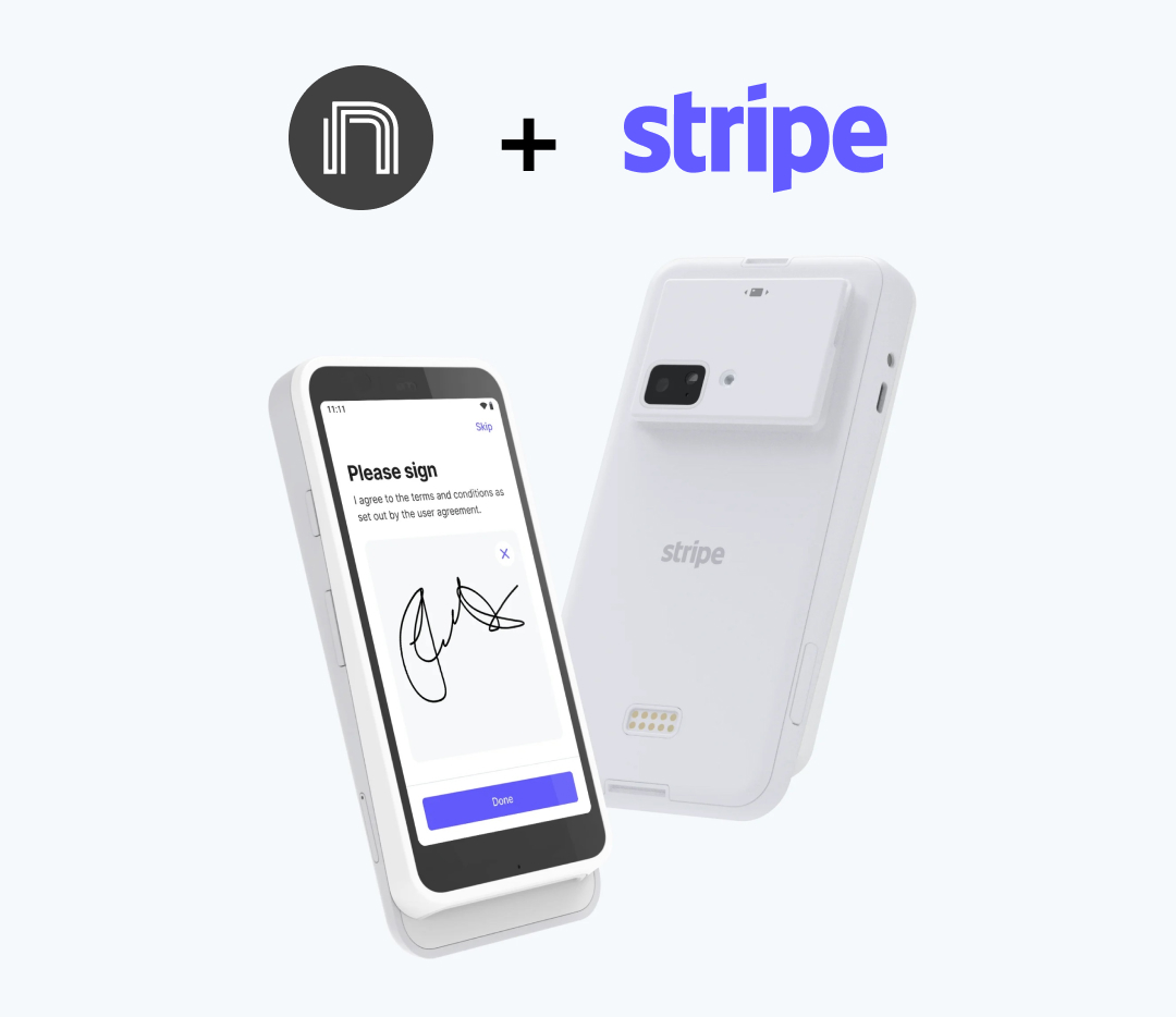
Making a hardware product of our own was out of the question, it was immensely complicated and our expertise is on software. We made the decision to partner with Stripe due to their reasonable fees, easy to use hardware, and flexible API. I became quite familiar with their API capabilities, both for the payment processing as well as communicating with the hardware device.
Research
Our research involved talking with practices about their current in-office payment workflow to discover any pain points we could alleviate, and to validate any assumptions we had about their process.
What we learned
- There was a high switching cost for some folks, since their current systems stored patient info & credit card numbers.
- Business owners typically were most concerned with the rate, whereas the front office staff was more concerned with workflow & the patient experience.
- We had assumed there would be a high need to handle multiple patients checking out a once, but that turned out not to be a concern for any practices we talked to.
- While many users prefer email receipts, paper receipts are much more commonly requested than we had assumed, and PDFs are necessary for uploading to the patient’s health records.
We prioritized features based on an MVP model, what could get users up & running fast so we could gather feedback. This made a limited pilot program a natural place to start.
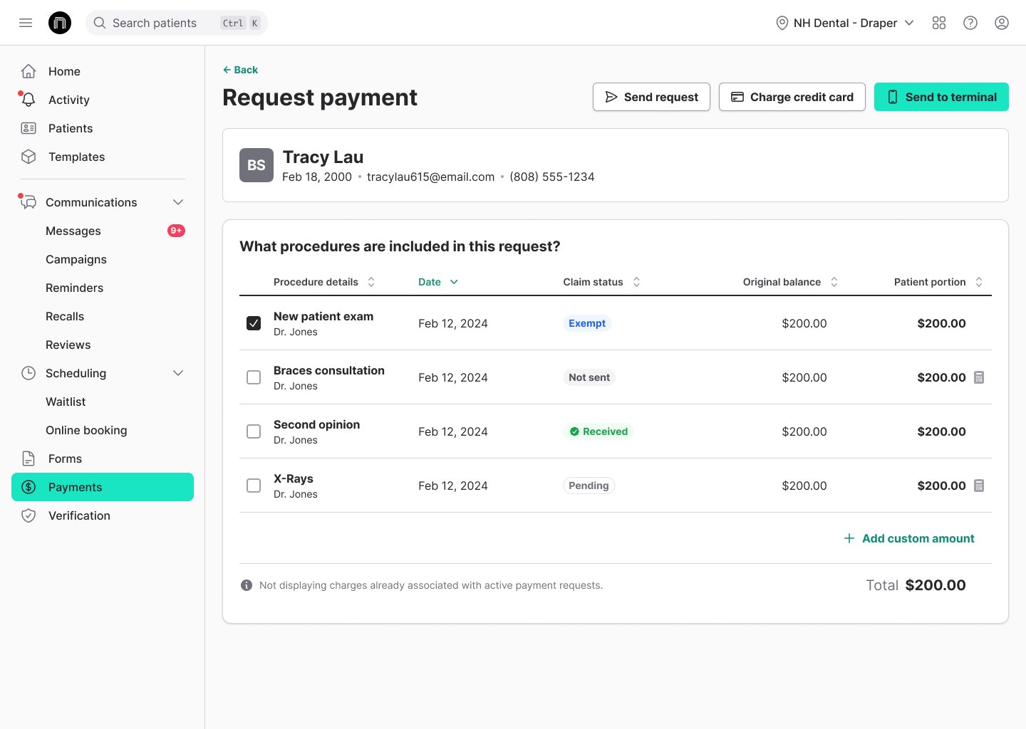
Phase 1: Pilot program
We started with a handful of existing customers, including only those who were using our non-syncing payment product to avoid additional layers of complexity. Our first cohort was very manual, hand delivering the new terminals and setting them up in person. We uncovered a few usability issues to fix for our next phase, which included a discovery issue during initial setup and clarity around transactions being completed on the patient-facing side.
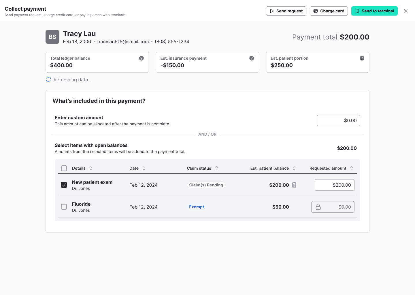
Phase 2: Limited beta (with ledger sync users)
We added a significant number participants in the beta program, this time adding customers using our ledger sync product. Ledger sync added significant complexity, and we discovered a few issues we had to fix around sync speed. We obviously tackled this both from a technical perspective, making huge gains in our sync speeds. But we also made changes to the experience, which alleviated perceived wait times.
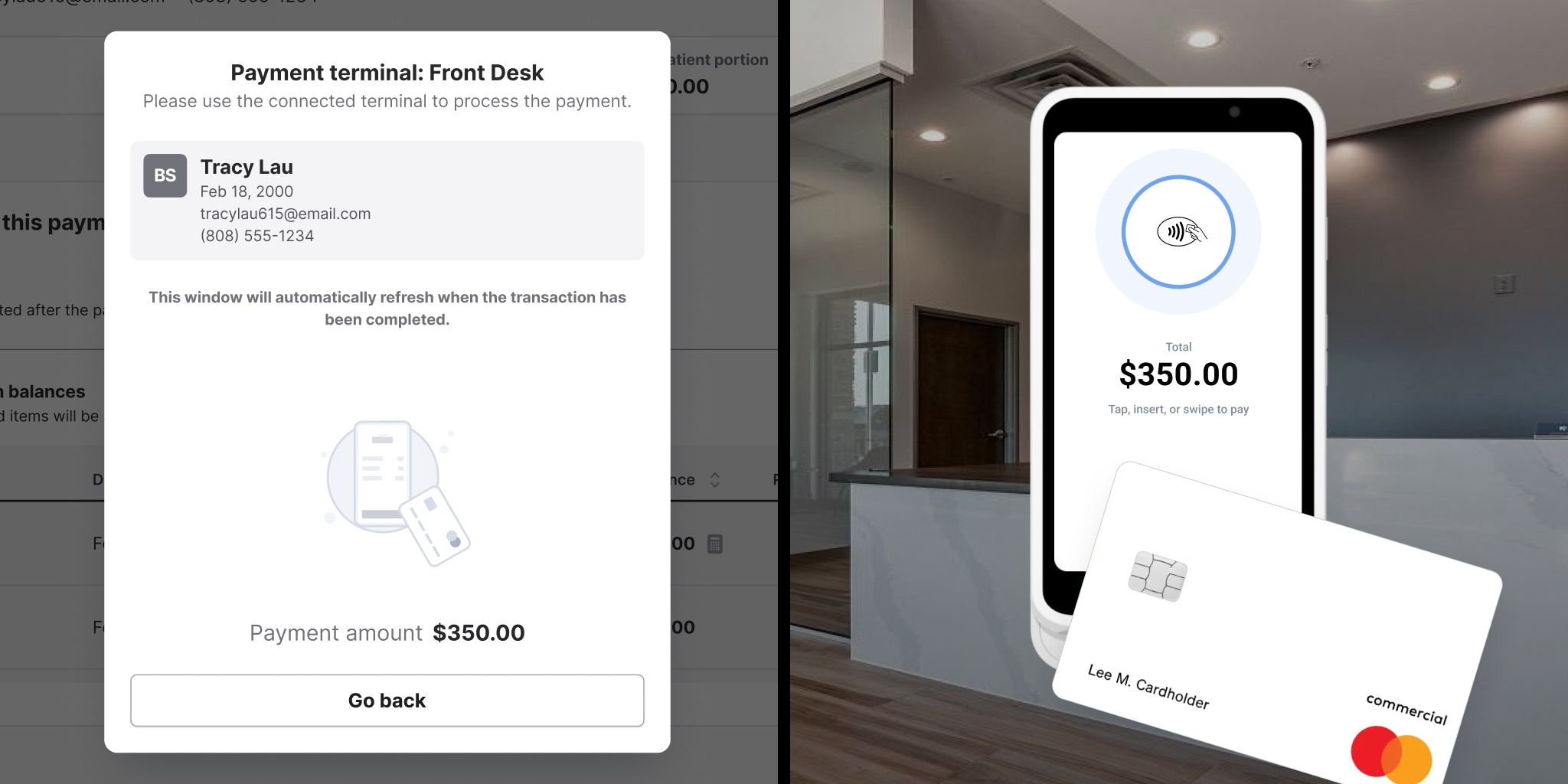
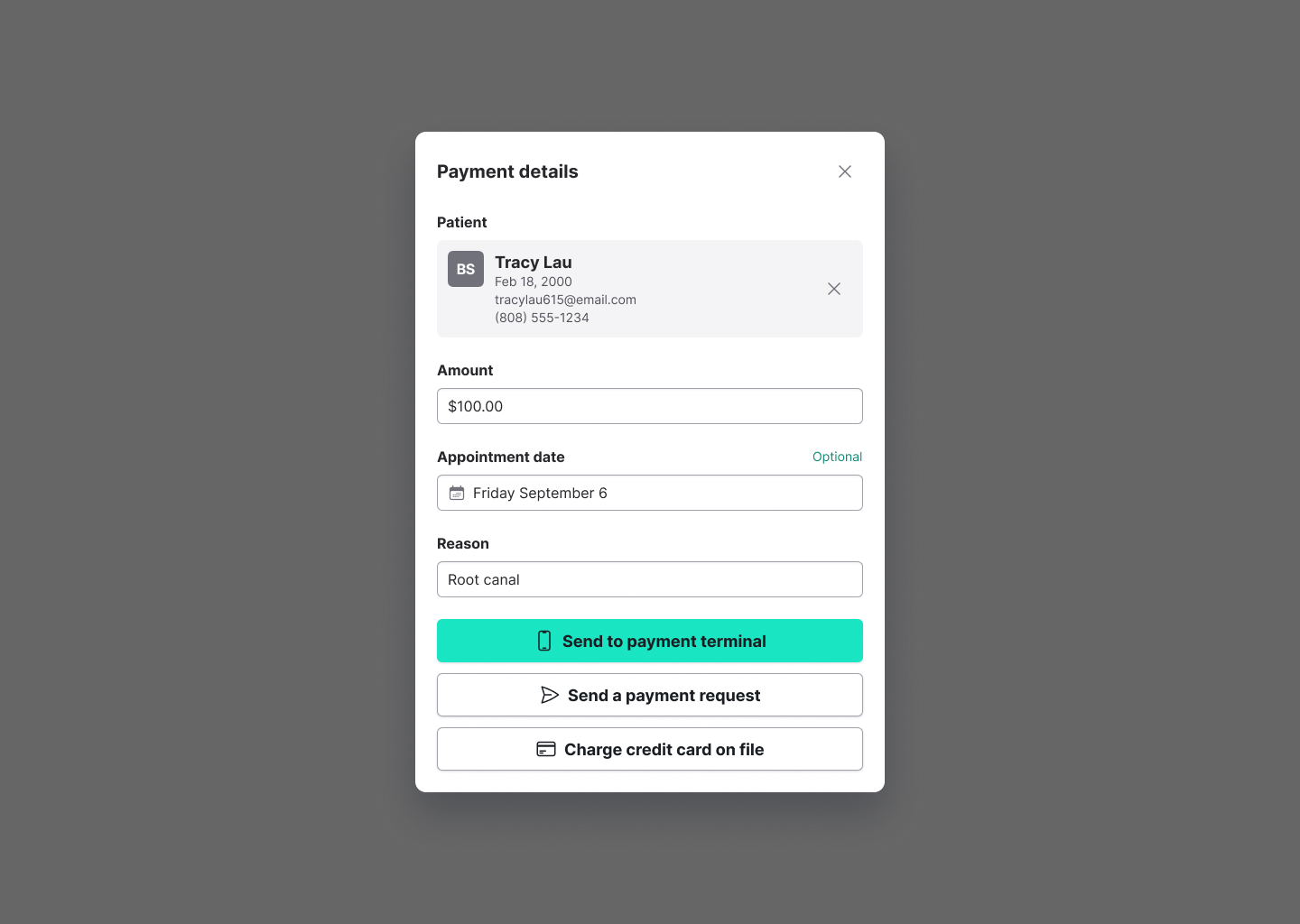
The payment collection interface was different for the ledger sync and non-sync customers, but we've been wanting to combine them for a while. Since the terminal payment collection has multiple entry points, it made sense to use a new pattern we developed for a full screen modal. This allowed the user to accept a payment anywhere in the web app, and return where they left off without losing their place.
Original non sync UI, contained in a modal
Original ledger sync UI, a full page in the webapp
New combined UI + full screen modal presentation
I was super excited to be able to create a couple animated SVGs for the interface, which add clarity to the workflows and add a bit of visual polish & delight. Typically things like this never end up getting implemented, but I used this as a relationship building opportunity with our frontend engineers and pair programmed to add these into the codebase myself.

Looping animation while waiting for patient to tap their card on the reader

Success animation when the payment goes through successfully

Work in progress, animation for a loading state
Phase 3: GA release
After much learning and improving the product, we were ready to release it to our full set of users. Our revenue numbers were higher than we expected, and customers were using even our other payment features more as a result.
Final experience
Terminal payment flow from the practice's perspective, plus patient-facing card tap on the terminal device.
The future of terminals
The journey so far has been about building features that will fuel growth and create a seamless user experience, while leaning heavily on our sales and onboarding teams. Future phases will focus on scaling: self service ordering and in-product onboarding, both of which I've already started working on.